
How to Create a Church Website That Feels Calm and Welcoming
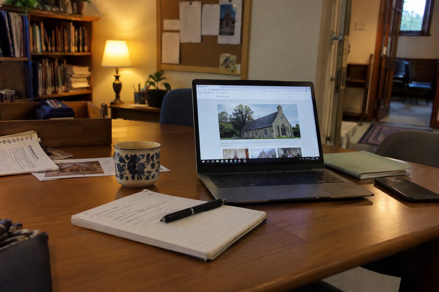
To create a church website, start with worship times, directions, a welcome for newcomers, and a simple explanation of your church's faith and worship. Then choose an editing platform, build a small set of pages, apply a restrained design, and test everything before publishing.
Aim for a website that feels like a thoughtful invitation, not an advertisement. Let clear words, readable type, and carefully chosen photographs carry the welcome. Give liturgical teaching room without making visitors work to find the front door.
1. Decide what the website needs to do
Before choosing a theme, agree on three priorities: help someone attend worship, explain what they will encounter, and keep the congregation informed. Treat everything else as a possible later addition.
Assign a content editor, a backup editor, and someone authorized to approve teaching about worship and belief. Ask your pastor, priest, or designated leader who should review that material.
Start with this manageable page plan:
| Page | What to include |
|---|---|
| Home | Church name, location, worship times, brief welcome, and a link for visitors |
| Visit | Directions, entrance information, parking, accessibility details, and what to expect |
| Worship | Regular services, special schedules, and explanations of local worship practices |
| Faith and learning | Approved teaching, introductory reading, and resources for further study |
| Events | Upcoming gatherings with dates, times, locations, and contact information |
| About and contact | Church identity, leadership, office contact details, and a way to ask questions |
Use these as planning suggestions, not a requirement to launch six separate pages. A small church could combine pages rather than publish empty sections.
2. Choose an editing platform and arrange ownership
Try a platform with the volunteer who will actually maintain the site. Ask that person to change a service time, add an event, upload a photograph, and correct a paragraph before committing.
Use this purchasing checklist:
- Can your editors update pages without outside help?
- Can you control colors, headings, menus, and image descriptions?
- Does the mobile preview leave service times easy to find?
- What are the full ongoing costs, including hosting, domain renewal, and support?
- Who handles software updates, backups, and account recovery?
- How can the church retrieve its content if it leaves?
Keep the domain registration and recovery details under church control. Record who handles renewals and where authorized leaders can find account information. Ask the provider for instructions before connecting an existing domain, and explicitly ask how to preserve church email.
Build and review the new site before replacing an existing one. Keep a list of old page addresses to discuss with the provider during the move.
3. Teach the liturgy in small, welcoming layers
Make the Worship page useful to someone who has never attended. Begin with the practical experience, then offer deeper teaching below it.
Start with what a visitor needs
Ask your approved reviewer to help answer:
- What is this service called, and what happens during it?
- What should a newcomer know about standing, sitting, singing, or following a service book?
- What arrangements are available for children?
- What should visitors know about Communion or other forms of participation?
- Who can answer a question before the visit?
Use your church's own terminology, but explain it at first use. Do not copy another congregation's participation instructions or assume they apply locally.
Add a short seasonal teaching section
If your church observes a liturgical calendar, consider a small section titled "This season in our worship." Include the season's name, a short approved explanation, the relevant local services, and a link to an official teaching resource.
For a Roman Catholic example, the General Instruction of the Roman Missal assigns green to Ordinary Time, violet or purple to Advent and Lent, and white to Christmas and Easter Time. These are rules about liturgical vestments, not instructions for website backgrounds. USCCB: liturgical colors, paragraphs 345-346. (usccb.org)
Do not present that example as a universal Christian calendar. Confirm colors, dates, terminology, and teaching with your own denomination, jurisdiction, and local leadership. If seasonal observance is not part of your church's practice, use this space for an approved introduction to worship instead.
4. Choose restrained colors with readable contrast
As a design starting point, choose one light background, one dark text color, and one main accent. Add a secondary accent only when it has a clear purpose.
These are suggested visual directions, not liturgical prescriptions or tested color combinations:
| Direction | Background | Text | Accent |
|---|---|---|---|
| Warm and understated | Warm white | Deep charcoal | Muted burgundy |
| Simple and spacious | White | Dark slate | Deep blue |
| Quiet and natural | Pale stone | Near-black | Forest green |
Test the exact shades before publishing. Under WCAG's Level AA contrast criterion, ordinary text generally needs at least 4.5:1 contrast against its background; qualifying large text needs at least 3:1. A color name alone cannot establish whether a combination passes. W3C: contrast minimum. (w3.org)
For seasonal changes, consider changing a small banner or accent rather than recoloring the whole site. Keep the navigation and page arrangement consistent. Label the season in words rather than relying on purple, green, or another color to communicate it; W3C advises against conveying information through color alone. W3C: accessible design. (w3.org)
5. Pick readable fonts, not decorative ones
For a calm starting point, try a simple serif heading with a plain sans-serif body font. Alternatively, use one readable family throughout and distinguish headings by size and weight.
Merriweather for headings and Source Sans Pro for paragraphs is one pairing to test if your platform offers them. The U.S. Web Design System describes Merriweather as designed for screen reading and Source Sans Pro as designed for interface legibility. USWDS: typography. (designsystem.digital.gov)
Suggested starting settings are 18-pixel body text and line spacing around 1.5. Treat those as trial settings, not accessibility guarantees. Read a full paragraph on a phone before approving them.
Avoid long passages in all capitals. Keep paragraph widths moderate rather than stretching text across the entire screen. Both choices follow the USWDS typography guidance. (designsystem.digital.gov)
Reserve ornamental lettering, if used at all, for a small decorative detail. Do not make visitors decipher service times or directions.
6. Build a quiet homepage
Try this order:
- Church name and town or neighborhood.
- A short welcome that identifies your tradition.
- Worship times and a clear "Plan your visit" link.
- One well-chosen photograph.
- A brief introduction to worship or the current season.
- A small selection of upcoming events.
- Address and contact details.
Prefer a still image to a rotating slideshow or background video for this design. Avoid automatic music and competing announcement popups. If you do use automatically moving content, provide appropriate controls; W3C's design guidance calls for controls over content that starts automatically. W3C: accessible design. (w3.org)
Choose photographs deliberately. Consider an exterior view that helps visitors recognize the entrance, or an uncluttered interior view that introduces the worship space. Put essential information in page text, not only inside a poster image.
Use descriptive headings, meaningful links such as "Sunday worship times," and appropriate text alternatives for informative photographs. Provide captions and transcripts for teaching media as appropriate. These practices follow W3C's writing guidance. (w3.org)
7. Check the site before launch and keep it current
Ask someone unfamiliar with the project to find the next service, locate the entrance information, and send a question. Watch where they hesitate rather than explaining the menu to them.
Before publishing, check:
- Worship times, address, telephone number, and contact email are correct.
- Seasonal teaching and participation instructions have leadership approval.
- Text, menus, and buttons work on a phone and remain usable when enlarged.
- Links, contact forms, and any giving links have been tested.
- Private directory information and internal documents are not on public pages.
- Each page has a named editor and a review date.
Avoid three common design traps: filling the homepage with every announcement, using pale text to create a gentle mood, and publishing seasonal teaching without assigning someone to update it.
Schedule a short weekly check of service changes and upcoming events. Review teaching before each relevant season, and revisit contact details whenever responsibilities change. Start with a modest site you can care for consistently, then add pages when there is a clear need and someone to maintain them.
Doing this in Chapel Desk
Chapel Desk includes a hosted church website with three themes, church colors, custom pages, and editable navigation. You can publish worship explanations and seasonal teaching on pages or blog posts, and share service books in the document library.